Android runs on a variety of different devices. In order to improve the way your app looks on different phones, depending on their screen size and resolution, Android offers the possibility to use different layouts for different screen sizes. This is the topic I’ll discuss in this article.
Summarizing the Demo Application
First of all, I would like to briefly discuss the app, the optimization of which will be discussed below. The app serves as a tool for the card game “Magic the Gathering”. While this app was my first real application for Android, this side project has evolved over time and accompanied me on the way to Android development. I maintain the sourcecode on GitHub and you can download the app via PlayStore.
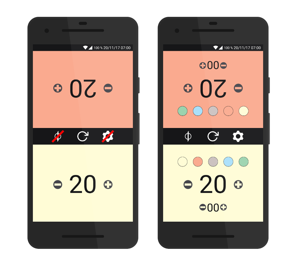
The feature at issue is simply managing the health of two players. Poisonpoints can also be managed, which use a similar functionality. Finally, the player can choose the color of his or her playing area using the appropriate controls.
The Problem …
So far, so good, this functionality has proven itself since the first release version of the app. But with the changes I’m working on, I’m about to implement an optional 4-player view. Of course, there is not unlimited space on a smartphone screen, which is why I had problems with the display of all of the controls in the style of the 2-player version. When using smaller devices (in terms of pixel density), the image buttons that allow the player to select his background color moves over the lifepoints and the Poisonpoints are displayed too close to the edge of the screen, so that the whole app doesn’t really look good.
However, while this view is problematic for smartphone screens, tablets work quite well. For this reason, I would like to maintain the view for tablets, but adapt it for smaller devices. To make this description more specific: My 10-inch tablet should use the default view, while my Redmi Note 4 (5.5-inch) and my Nexus 5 (5-inch) should use the customized view. All three devices have a Full-HD display with a resolution of 1920 x 1080 px, which allows easy comparisons between them. The Redmi Note 4 should additionally be used as the maximum size for the customized layout, since the view is no longer really shifted here, but still looks quite suboptimal. The following picture shows the planned layout for the 4-player support.
… and its Solution
This post on the Android developer documentation gives a pretty good overview on the different screen sizes and the pitfalls to be considered. Basically, two factors play an important role: The physical screen size of the device (inches) and its pixel density. The various influencing variables then aggregated to groups. While this separation for screen sizes is divided into the values small, normal, large and xlarge, the following values exist to categorize the pixel density:
- ldpi ( ~120dpi)
- mdpi ( ~160dpi)
- hdpi ( ~240dpi)
- xhdpi ( ~320dpi)
- xxhdpi ( ~480dpi)
- xxxhdpi ( ~640dpi)
And it’s exactly these different categories that are interesting now: Low resolution means little space for placing controls, so I’m going to design a special representation for such devices. You can create layouts separately for different screen resolutions, so the above categories can be controlled individually.
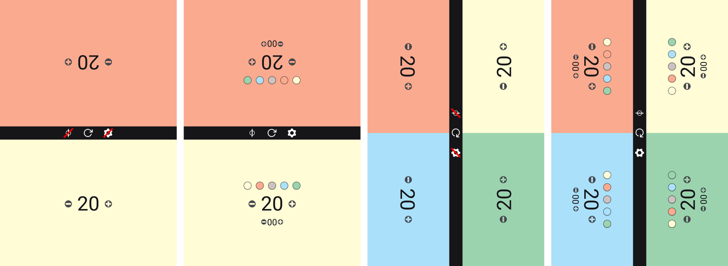
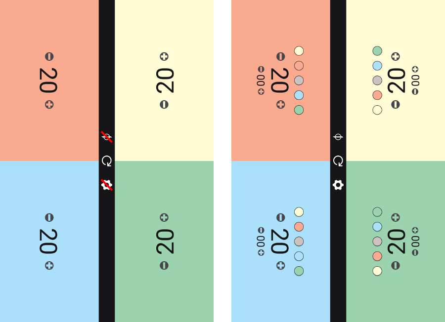
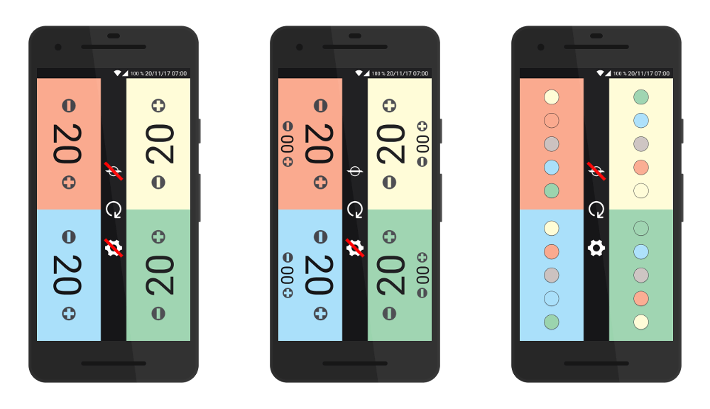
I want to realize my idea as follows: devices with high screen resolutions should display the four-player view similar to the two-player view. All devices that are smaller will use a fallback layout which adds a little functionality. Here, the display of life- and poisonpoints should be hidden by pressing the setting button, but the colour selection should be shown instead. If the Poisonpoints are to be displayed, the Lifepoint display is shifted a little to the center of the screen. The following pictures are the best way to understand this.
Within your Res/Layout folder, you can now create folders for the different resolutions. The necessary naming convention is based on the prefix “layout-” and the subsequent size.
Since I only use the additional view for high-resolution devices, I create a folder “layout-large”. I use the previous layout file as a basis, copy it to the newly created folder and start editing the original file. I have to point out that to create the folder and thus the layout file, it is necessary to switch to the project view in Android studio. In the standard view, the folder remains invisible.
I now adjust the layout so that the life and poison points are displayed below each other, the color selection is centered above the point display. This is not a problem, since the visibility of these controls will always be toggled. To be able to follow the adjustments exactly, you can check out both entries on my GitHub profile:
The adjustments to toggle between the different states are dynamic and are controlled by Java code. I’ve added the following code to be able to get the current devices resolution:
javascreenLayout = getResources().getConfiguration().screenLayout & Configuration.SCREENLAYOUT_SIZE_MASK;
This returns an integer value. By using the following constants, I make it easier for myself to differentiate between them:
private final int SCREEN_NORMAL = 2;
private final int SCREEN_LARGE = 3;
private final int SCREEN_XLARGE = 4;```

And that's it, actually. I use an activity for the game itself, which controls both the 2-player and 4-player view. To toggle the state of the different controls I use corresponding methods, which I have equipped with a Boolean parameter This tells me whether or not the corresponding controls should be repositioned. I set this initial as follows:

```javarepositionControlsOnToggle = screenLayout != SCREEN_XLARGE && view.GetPlayerAmount() == 4;```

If you have any further questions, you can find the complete source code on [GitHub](https://github.com/MarcelJurtz/LifeCounter).